A "brand" is the rational and emotional relationship you have to a product, service or business. And while a great deal of research, management, and money are allocated to consumer branding, the smartest organizations also focus on cultivating and managing their internal – employer – brand.
Here are some examples of how I've helped clients do just that.
Here are some examples of how I've helped clients do just that.

Host Hotels & Resort

Before it was Host Hotels & Resorts, it was Host Marriott Corporation.

What Host asked for was a simple compensation report cover. To me it was an opportunity to expand on the nature of compensation. So I took the cube and triangle from their logo and personified the employee behavior necessary for both individual and enterprise growth.

Named after Stephen Lundin's book Fish, and charged with promoting and expanding employees' understanding of teamwork, Host's "Fish Team" had energy and ideas. What they didn't have was a brand. So using the same two shapes, I created their logo and tagline.

Photographic imagery always presents challenges to internal communications. Representing the proper balance in regards to race, gender, age, sexual identity, comes to the fore. So, by personifying two simple geometric shapes, I was able to avoid the issues of representation and focus on the positive behaviors associated with teamwork.

Like too many corporate intranets, Host's had become that digital closet you just didn't want to open. So, working with IT, HR, and corporate communications, I helped create a new information architecture based on a self service UX model, a more intuitive interface, and a name that linked a mission to be more efficient with the control to do so.
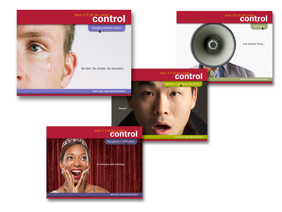
Ah, but why go to all the effort if no one knows it's there. So I created a teaser campaign that highlighted the functionality people were asking for.

US Pharmacopeial Convention (USP)

Like a lot of organizations with in-house creative capabilities, the primary focus for USP's Communications & Design department was (rightly so) external marketing. But that shouldn't mean poor service and sub par creative for internal clients like HR, Legal, and the ExComm.
So when I was asked to create covers for comp and benefits documents and the recognition program brochure, I shifted the emphasis from "what" to "so what," by giving the documents a point a view. The idea was to establish HR's voice in the organization.
So when I was asked to create covers for comp and benefits documents and the recognition program brochure, I shifted the emphasis from "what" to "so what," by giving the documents a point a view. The idea was to establish HR's voice in the organization.

When the head of HR expressed a desire to feature the organization's core values more prominently within the HQ building, I saw the opportunity to establish a platform on which we could build ongoing communications about the values. So, I first turned the core values into a "thing" by creating a signature look.

"We need posters..." That was HR's idea. But with a growing art collection occupying a lot of the available "media" (wall space), thus creating visual competition for eyeballs, I thought a better solution would be to put the values where no one could miss them. These floor to ceiling graphics cling to the windows of the employee break room, bringing the values into plain sight.

I created this graphic for the values section of the USP intranet. In doing so, I wanted to suggest that the values were interdependent and continuous rather than compartmentalized as they'd been represented before.

NeighborCare Pharmacies

Large retail pharmacy chains pay pharmacists top dollar, but the work hours often leave little time for a personal life. While NeighborCare couldn't compete on salary, it could offer a far better work/life balance. This entire recruitment campaign – for which I was copywriter and art director – put a new "life at work" spin on industry jargon in ads, direct mail, collateral, and trade show materials.


